Thursday, 19 December 2013
Wednesday, 16 October 2013


Monday, 14 October 2013

Saturday, 12 October 2013
Drafts of double page spread 2 and peer feedback

This is my peers favourite double page spread that I have created. Some positives of the double page spread are that it has space for lots of text and information. The image also fits the article very well and is the main focal point of the pages. Some constrictive criticism would be to add more colour to the article. The text could also be changed to make the article look more professional.
Friday, 11 October 2013

Thursday, 10 October 2013

Tuesday, 8 October 2013

Monday, 7 October 2013
Drafts of contents page 2 and feedback

I had insperation from this existing magazine contents page. I believe this is my best contents page. My peer also believes this is my best mock up of a contents page. This is because the colours blend in really well and stand out. The logo is also used on the contents page which makes the magazine contents page recognisable. Some negatives that could be improved are the amount of blank space that is on the page. This could be improved by adding more pictures to the contents page.

Sunday, 6 October 2013


Saturday, 5 October 2013
Final front cover with feedback
I completed a survey and told 20 people to complete it to
find if my final cover is appropriate.

https://www.surveymonkey.com/s/7LMKSZ5
These are my results

Friday, 4 October 2013

Thursday, 3 October 2013

Wednesday, 2 October 2013

Tuesday, 1 October 2013

Tuesday, 24 September 2013
Image planning
|
Model:
|
Louis Chadwick
|
|
Camera
height/angle/distance:
|
Medium shot / straight ahead /
approximately 3 metres away
|
|
Location:
|
Thrift shop
|
|
Lighting:
|
Nothing added, natural lighting.
|
|
Mise-en-scene (including props,
costume) :
|
Very modern clothes, trendsetting very
individual clothing to be different
|
|
Attempted
connotation:
|
Trendsetter, different, stand out
|
|
Planned
denotation:
|
Main subject pulling a confident pose
|
|
Contingency
(in case of model absence/weather):
|
The picture will be taken inside
|
|
Alternate
angle:
|
Low angle aiming up empowering the
model.
|
|
Thinking
points: Use of artificial light in contingency and
using a filter on the camera
|
|
|
Comments: Chosen
models are representative of modern culture.
|
|
Monday, 23 September 2013
Image editing


Colour palettes
Colour symbolism is when a colour represents means and shows.

 The colour red is used for many things in society. One of
the main symbols of red is danger. The colour red has been associated with the
danger in many ways such as heat, fire and blood. Today we use the colour symbolism
of red to show danger in traffic lights and road signs. Another colour symbolism
of red is love and passion.
The colour red is used for many things in society. One of
the main symbols of red is danger. The colour red has been associated with the
danger in many ways such as heat, fire and blood. Today we use the colour symbolism
of red to show danger in traffic lights and road signs. Another colour symbolism
of red is love and passion.

RED - I have used red to show the fear and danger that is associated with my genre. Rap is a type of music that covers bad things such as depression, death and love. The colour red represents all of these things.
WHITE - This represents a clean slate for the artists to work on leaving the bad things behind in their life to follow their passion of music.
BLUE - This is the opposite of red, a very calm colour but it can be linked with depression which is covered by rap artists very regally.
 The colour red is used for many things in society. One of
the main symbols of red is danger. The colour red has been associated with the
danger in many ways such as heat, fire and blood. Today we use the colour symbolism
of red to show danger in traffic lights and road signs. Another colour symbolism
of red is love and passion.
The colour red is used for many things in society. One of
the main symbols of red is danger. The colour red has been associated with the
danger in many ways such as heat, fire and blood. Today we use the colour symbolism
of red to show danger in traffic lights and road signs. Another colour symbolism
of red is love and passion.
The colour blue is associated with the opposite of red. The main symbolism of blue is peace and tranquillity, this is because blue is the colour of the sky and is also associated with the sea. The sea is blue and it is represented as clean thus is why blue is linked with cleanliness. Blue is also a dark colour and so is sometimes lined with depression.
RED - I have used red to show the fear and danger that is associated with my genre. Rap is a type of music that covers bad things such as depression, death and love. The colour red represents all of these things.
WHITE - This represents a clean slate for the artists to work on leaving the bad things behind in their life to follow their passion of music.
BLUE - This is the opposite of red, a very calm colour but it can be linked with depression which is covered by rap artists very regally.
Sunday, 22 September 2013
Language and register
I have used informal language throughout my magazine. On the
other hand I have made sure the spelling and language is suitable for all
audiences. The language I have used is suitable for my target audience as it doesn’t
use a complicated language or text. This is suitable because my target audience
is the younger generation in middle to lower class.
Although I have used informal language within my magazine, I have still made sure that my magzine is professional and that everything is spelt correctly.
Although I have used informal language within my magazine, I have still made sure that my magzine is professional and that everything is spelt correctly.
Saturday, 21 September 2013
Layouts
This is the layout i will follow to make my magazine. It is very conventional to a music magazine with QR codes and barcodes in the bottom corner out the way of the main image. I have also decide to put the masthead at the top because this is where the reader looks fist.

Friday, 20 September 2013
Representation
I have represented a particular age group and gender of
14-24 males that are interested in rap. This is represented by the clothes that
the subject wears on the magazine. The vibe magazine is aimed at a similar audience.
This is why I chose the clothes I did for my magazine; it is a very different
way to dress. I have not used formal language but it has good spelling and grammar
as it is a magazine.


Tuesday, 17 September 2013
Names & Masthead fonts


I asked a range of pupils from my target audience age
bracket to see which masthead was most aesthetically pleasing. From these
results I decided to use the masthead "RaWR" in the "American
purpose" font. I will have no colour scheme for my masthead and I will un
conventionally change the colour of my masthead monthly to fit the cover of the
magazine. I have moved away from this convention as it looks better and more
professional. My final masthead has a conventional
font for a modern rap magazine as it has a sans serif font because it is moving
away from a older style of magazine. My magazine is trying to be modern and cutting edge in terms of news.
Target audience
I made a survey to find out what certain types of people like certain hobbies and if they own a smart phone and an email address. This is my survey: https://www.surveymonkey.com/s/TRK6VNP
From this survey can conclude who my audience is and what interests they have. This is good because I can also find who reads my magazine for my adverts. From the survey I concluded that my target audience are 14-24 year old males that also have interests in football and gaming.
A similar magazine to mine is Vibe, this is based in the US. Their website has a very young audience I can tell this from the bright colours and the types of news stories they cover.
I also made a survey that I would give to my target audience. https://www.surveymonkey.com/s/B65R5S3
This represents the age my audience would be.
This is very useful because i can use this to aim my magazine at a particular age without harming the sales of my magazine.
I Then have found my target gender, The results were predominately male.
I then asked my target audience whether
they had a smartphone.
The results were very positive and
95% of the people I gave the questionnaire had a smart phone. This gave
me an idea to have a QR code on my magazine that my audience can scan with their
smart phone and enjoy free songs and videos. These would be in the form of an app;
this would make money from advertising revenue.
I have used a mixture of primary research, the results I
collected myself and also secondary information from the website Vibe. Vibe is
a similar magazine to mine but is only distributed in the United States. This
means it has the exactly the same culture and following.
Monday, 16 September 2013
Genre


These are two magazines in my chosen genre. These are two
Vibe magazines that are published in the USA. They are not available in the UK,
these magazines are aimed at a younger generation this drastically changes the
way the magazine is printed. First off all there is a QR barcode that is used
so that people with smartphones can scan for free information or advertising.
There is also very little over facing text as it is aimed at a younger audience.
For the reasons above I have chosen to cover a rap magazine
as there is a nice in the UK market for an R&B/Rap magazine. I will be able
to create a good magazine as I have an interest in rap and so do my friends so
it will be easy to get feedback on my magazine. This means is also have knowledge
of this genre and I am interested in.
Sunday, 15 September 2013
Analysis of existing magazines' DOUBLE PAGE 3

This double page spread is from a issue of Empire, the spread is an article about the film "I am legend" a film that was soon to be released staring will smith. The spread is mainly made up of one main image of a scene from the film but unusually the cameras and the camera man are shown, this is because it is a feature about how the film was made meaning the image is not to advertise the film itself. The article consists of two images that show one screenshot of the film and a behind the scene shot showing that the Empire magazine had a behind the scenes look at this film with exclusive access and quote and interviews with will smith. The image has a sticker with a fact on this is to attract your attention and feel like you've learned something from the article. The text its self is set out in different fonts for different types of speech for example a quote is wrote in a larger text and is framed with the films style. The colours used are very plain and simple and light colours because of the nature of the article it is a behind the scenes look at the film not explaining what happens.
Analysis of existing magazines' DOUBLE PAGE 2
Another convention that is used in the article in Empire magazine would be that the text is written in columns, the fact that the text is written in columns makes it easier for the readers of the magazine to actually read the article, and it also make the article look professional. The double page spread contains one main image that helps to show the readers of the magazine the characters that are in the new film, and what to expect from the film as well. There is also a selection stills from the movie and they help to give an idea to the audience what the film is actually about and gives a sense of the plot of the movie.
The text is written in white which helps the reader of the text to stand out from the dark background that Empire has chosen to use in this article. The colour of the text also makes it easier to read and means that it is quicker for the reader of the magazine to get the information they want from the article quickly. There is also a text box on the right hand page, this text box contains facts about the film, This text box has a orange background that stands out from the rest of the magazine double page spread.
Analysis of existing magazines' DOUBLE PAGE 1

This is a double page spread from a addition of Empire reviewing the new at the time "spider man 2". The spread is mainly made up of one image and that is the main star to give and show a quick overview. The colours are very contrasting with the boring background and plain colour scheme behind the text this makes spider man stand out along with the subheading and the rating. These three things are contrasting to the rest of the page because they are positive things that want to draw you into watching the film. The text that is on the page is simple and easy to read but there is a lot of text that may be of putting for some readers. The picture of spider man is looking right at his enemy we can tell this from the "enemy's tentacles" this shot shows the enemy spider man is up against and how he is the "underdog" of the situation.
Saturday, 14 September 2013
Analysis of existing magazines' CONTENTS 1
This is an insider magazine that that is very unique as it is framed at very unusual angle to draw attention to the main contents page. The most of the page is used for image space to keep the page looking simple and easy to read and not over facing to read. The text is rather small but it is very simple bold text so that it’s easy for the reader to find what page and article they would like to read.
The subheadings are larger and in a different colour to stand out so that it is simple to find what you’re looking for. The pictures heavily link to the articles in that show "game plan" which is one of the subheadings and it shows you a preview of the article. The colours one the page is mainly blues because that is the theme of a NFL football team. The page has a special features sub heading that advertises the main featured articles.
Analysis of existing magazines' CONTENTS 2
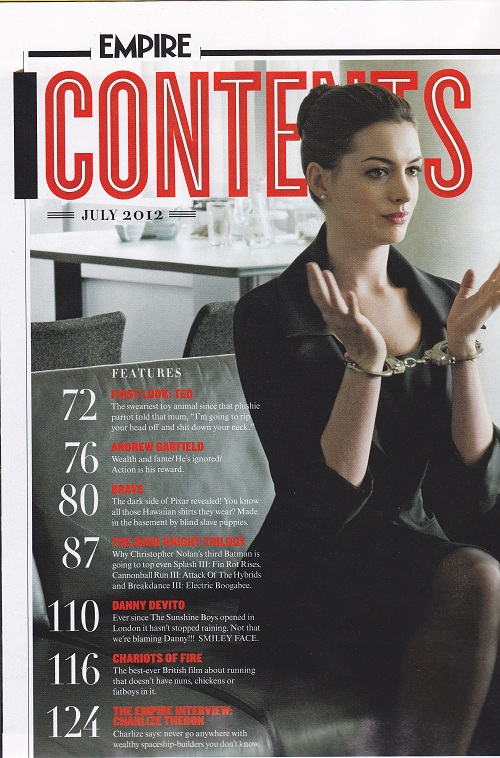
This is an Empire magazine contents page it is very similar
to most late Empire contents page because they use the same conventions of one
main image with very little text of the main features of this month’s magazine.
The contents page is very simple and does not over face the reader with text
but has the page numbers the features are on in very large numbers to attract
you to them pages even if you don’t actually read the contents page. The image
is mainly in black and white and so is the small text this naturally attracts
the eye to the colour because it is more interesting to look at. The contents
page does not have sub headings because it would clutter up the page and put you
off the reading the bulk of the text. The main image on the page which is also
the background links to one of the articles and gives you a glimpse of what’s
to come.
Analysis of existing magazines' CONTENTS 3

The content page has two sections one down the left hand side and one down the right side that frames the pictures in the centre of the contents pages spread. The text down the sides has the main features that are numbered to the page that they are on.
The numbers over the images have tags to pages that have features on them, under the features column it tell us a little bit of information about the article so we can decide if we either want to read the article or not.
The format of the text is very easy to read and is split up into 4 main sections these include features the main articles, regulars are things such as quizzes and the "in cinemas" and "at home" are film reviews for films that are newly released on DVD or at the cinemas. The colour scheme is blue so that it isn’t distracting but at the same time it looks good.
Friday, 13 September 2013
Analysis of existing magazines' COVERS 1

The main image is the rapper Eminem and the image is a medium camera shot, that covers the title showing he is "bigger" and more important than the magazine its self.
All the text on the page frames the main image showing he’s most important even the Splash is covered by the main image showing its importance. The text is also all in capital letters this suggests formality and is a basic font that is easy to read, the colours of the text sticks to two colours red and black this makes the text stand out towards the plain white background and shows danger and his prison attitude. The main rapper is wearing a vest to show his tattoos and muscles to show how much the rapper has been through and that he’s been here before and this pictures his character. The eye contact is direct showing that he’s the main event that he’s in charge and the pose suggests his thuggish style and his confident attitude.
Analysis of existing magazines' COVERS 3

The masthead is partially covered by the main image normally suggesting he is more important than the magazine but in this case the outline of the masthead is visible meaning he is important but not so important that the masthead is not visible. The font of the splash and sub headings are very dull colours to contrast the robe that the main image is wearing. The bar-codes also use the red from the robe to stand out, but not so bright that it distracts you from the main image and the title.
Analysis of existing magazines' COVERS 2

The main image is the singer usher and he takes up most of
the page with a medium shot of his face and his upper body. He is striking a
very confident and audacious pose that makes him seem like he’s ready for a
fight.
The colours on the page are very contrasting as the magazine
cover is very bland but this contrasts the very bright blue coat that attracts
your eyes naturally to the image on the page before you read the masthead, this
shows he’s the most important thing on the page more important than the
masthead on the page which is also covered up nearly entirely by the main image
on the page.The text font is matching to the masthead and is in capitals apart from the masthead as the text becomes closer to the main image it gets smaller this is for two reasons, the text would not fit if the font was bigger and because it gives an effect that the text is "scared" of the image and it takes not eye contact away from the main image. The pose suggests he’s "ready" this links to the splash that tells us his name and that he’s a hit man. The bright colour in the masthead makes it instantly recognisable and attracts your eye instantly after you’ve seen the main image.
Thursday, 12 September 2013

Wednesday, 11 September 2013
Evaluation of premiminary exersize
My media project uses conventions of a normal magazine, with
the use of a medium close up I could use the image I had taken as the
background of my cover. I know this is a convention because I looked at 10
school magazines; most of these used a medium close up. (see below)
.jpg)
I also created a
masthead to show the ethos and style of the school what the magazine was
representing. I chose to create a masthead I also created in a house style of
blue, grey and brown to match the image that I had taken. I have challenged the
usual conventions of a normal school magazine by using text boxes on my
contents page to make the contents of the magazine stand out. One way my
product challenges a school magazines convention is I made the colours on my
contents page look minimalistic and organised, this is unusual for a contents
page as they are normal full of images and articles to draw you into reading
them. I have used the convention of a
banner but I have developed this idea by having it half transparent, I did this
so it doesn’t hide any of the image.
My front page uses a house style that matches the pupil’s
uniform to fit the schools looks and ethos.
The schools ethos is to be enthusiastic but calm and collected, smart, respect,
dignity and pride. I have used colour symbolism to show the calm ethos as blue
is a clean and calm colour. I have also used a less formal text without serifs
as the school is trying to show a friendly ethos. The school is representing is
“aim for the highest” this is represented in the image I have used because the
camera angle is below the student, making him look “higher”. .jpg)
I have learned from my audience feedback that I have to fill up my home page so that it is more attractive and eye catching to read. I have used colours well to make the text look professional and sophisticated. I have also represented the schools ethos well. I have also found that my contents page needs more text and more images to make the reader want to read the articles inside my magazine.
I used Fireworks to construct both the cover and the contents pages of my magazine. I have learned how layer images and text in order so the most important is on the top layer covering the less important things. I also learned how to use custom texts to make my Masthead. In the planning stages and research stages I used the Internet to find similar products for inspiration. I also imported a font into fireworks, I have never done this before but I soon learned how to install and use new more interesting fonts from the internet. I could have used the program Photoshop but I would rather use fireworks as it has a new update that I did not know how to use.
Tuesday, 10 September 2013
Contents page, with drafts

I have used a house style of blue again because it links to
the colours of the school and to make it Recognisable. Also I have written my
contents on the picture in a clear space, which makes it look easier to read
and also you know that the contents link to the schools image. I have used an
image that links to the article "i5 computers arrive." this is a
picture I took of a student using the new devices. The theme is very formal I
have suited this theme by using 2 colours and not overfilling the page.
Front cover, with drafts

Sunday, 8 September 2013
Masthead fonts

This is my first text I have choosen because it is Formal and neat. The text does not have serifs this makes the font less traditional and more attractive to students. This text is less traditional compared to my other texts as the magazine is aimed at a young people.

This text is much more formal as it has serifs and the font
is all capitals, this is good for a masthead as it stands out from the rest of
the text on the cover. This is a traditional old school font that is generally associated
with American schools in films.

This is my last font that I am considering to use, I think
this font is good because it’s all capitals and it will be very different to
the main bulk of the text. The text reflects the image the school is trying to
project.
Subscribe to:
Posts (Atom)